- Home
- Portrait Drawing
- Eye Drawing Hub
- Most Common Eye Drawing Mistakes
6 Most Common Eye Drawing Mistakes (and how to avoid them!)
Part 2 of a 3-Part Video Series
Welcome
to Part 2 of the Most Common Eye Drawing Mistakes video series, where I’m sharing how
to fix (or avoid!) the 6 most common mistakes I see, that decrease the realism and
believability of an eye drawing.
Before you start, don't miss the free:
Draw Better Eyes Toolkit
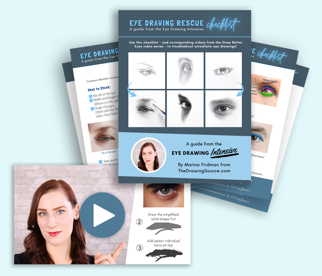
Fix the most common mistakes making your eye drawings look flat and unrealistic with 6 short video lessons and the Eye Drawing Rescue Checklist. Get the Toolkit here!
Watch Part 2 here:
Most Common Eye Drawing Mistakes (and how to avoid them!)
A F T E R T H I S L E S S O N:
Don't miss:
More eye drawing resources:
- Draw Better Eyes Toolkit
- How to Draw Realistic Eyebrows: Step by Step Tutorial
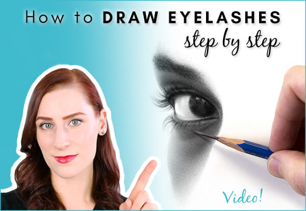
- How to Draw Eyelashes: Step by Step Tutorial [Video]
- 8 Tips for Drawing More Realistic Eyelashes [Video]
Tutorials on drawing the other features of the face:
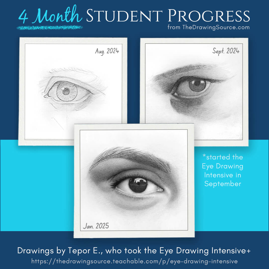
Or, transform your eye drawings in the:
Prefer to read? Here is the article version of the video above:
(... but the video is more detailed, I recommend it!)
Most Common Eye Drawing Mistakes
Mistake
3) Drawing details before establishing a value structure
There are so
many seductive details in an eye, that we all want to dive into! I want to draw
eyelashes, eyebrows and the beautiful, radiating fibers of an iris as much as
the next person.
But, the
order in which we add information to a drawing is very important. Adding
detail too early can actually lead to an unrealistic drawing, because ...
Details alone will not make your drawing look realistic.
They are the icing on the cake. Without the actual cake... there is no form for the icing to rest on! You bake the cake first, and then you ice it.
It
might be a strange comparison, but it’s the same with the details of an eye! We
must draw the larger forms and structures first, before adding detail on top.
One of the structures we must create before adding detail is called a value structure.
‘Value structure’ refers to where the light, half-tone and dark areas are on your subject.
So, imagine
drawing the eye below, using only three values: a light value, a middle value, and a
dark value.
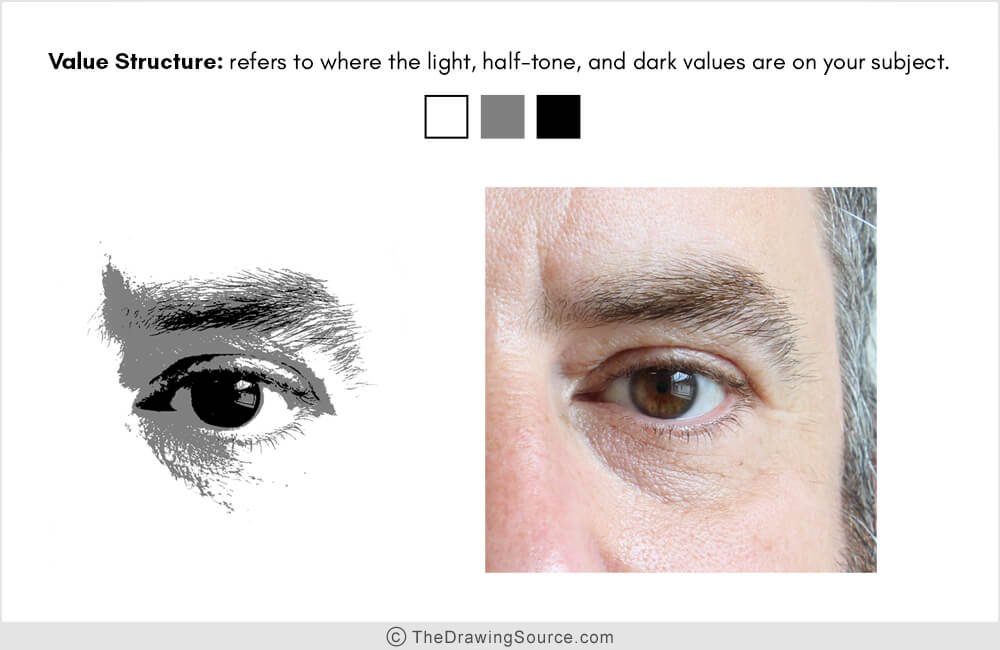
The result
is almost a 'posterized' version of the eye.
While
this might seem overly simplistic, it’s essential that you learn to simplify the
values of your subject, because:
To draw a realistic image, we must mimic the value relationships that appear on the subject.
So, the light values need to be light
enough, the dark values need to be dark enough, and the middle values or
half-tones need to be distinctly in between the two – so, lighter than the dark
values, and darker than the light values.
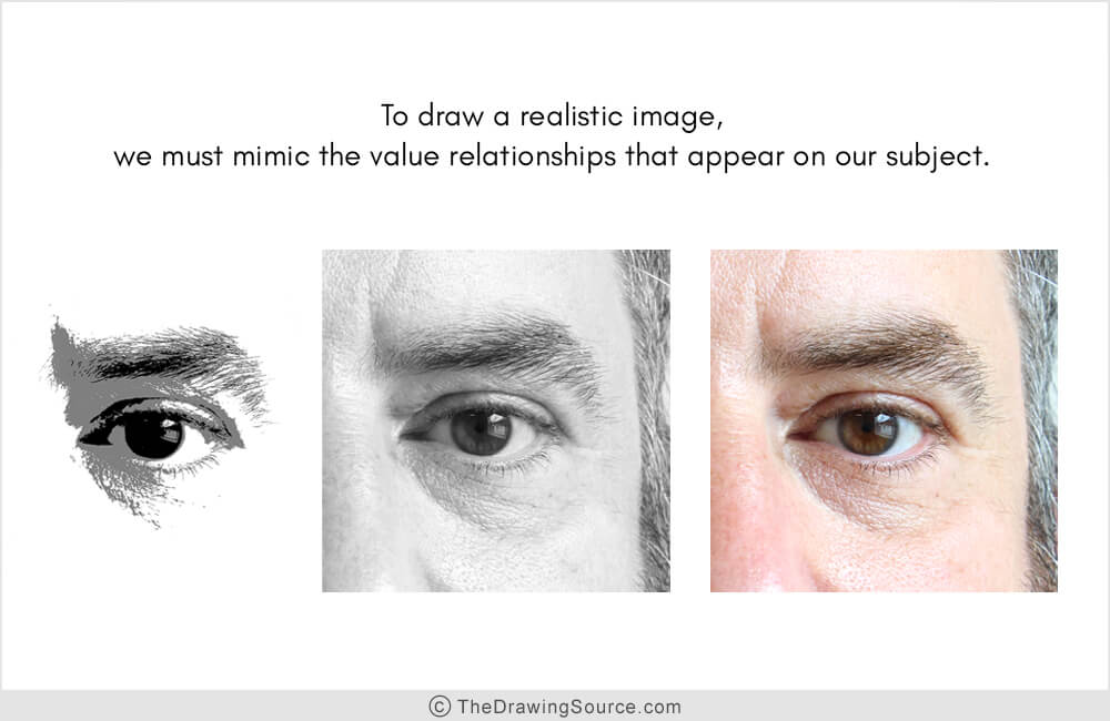
Within each
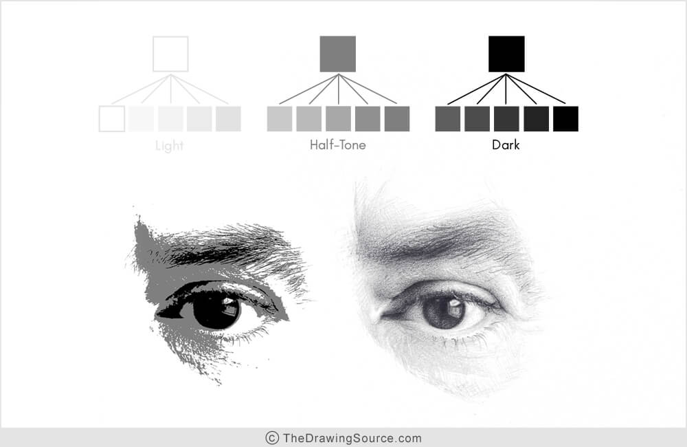
of these groups (light, half-tone and dark) there will eventually be a range of values, right? When we
start adding additional values, though, they have to remain within their assigned group!
So, all of
my half-tone values, no matter how many there are, must be lighter than my dark
values, and darker than my light values. If they are not (so, if we draw a
half-tone value that’s too dark and looks like a shadow value, for example) our drawing
will look unrealistic, because we haven’t accurately drawn the value
relationships that appear on the subject. We have 'broken' the value structure.
Below is an
example of this. This is a self-portrait that I drew, probably in junior high.
Looking more
specifically in the blue bubble, would you say that this area is in light or in shadow?
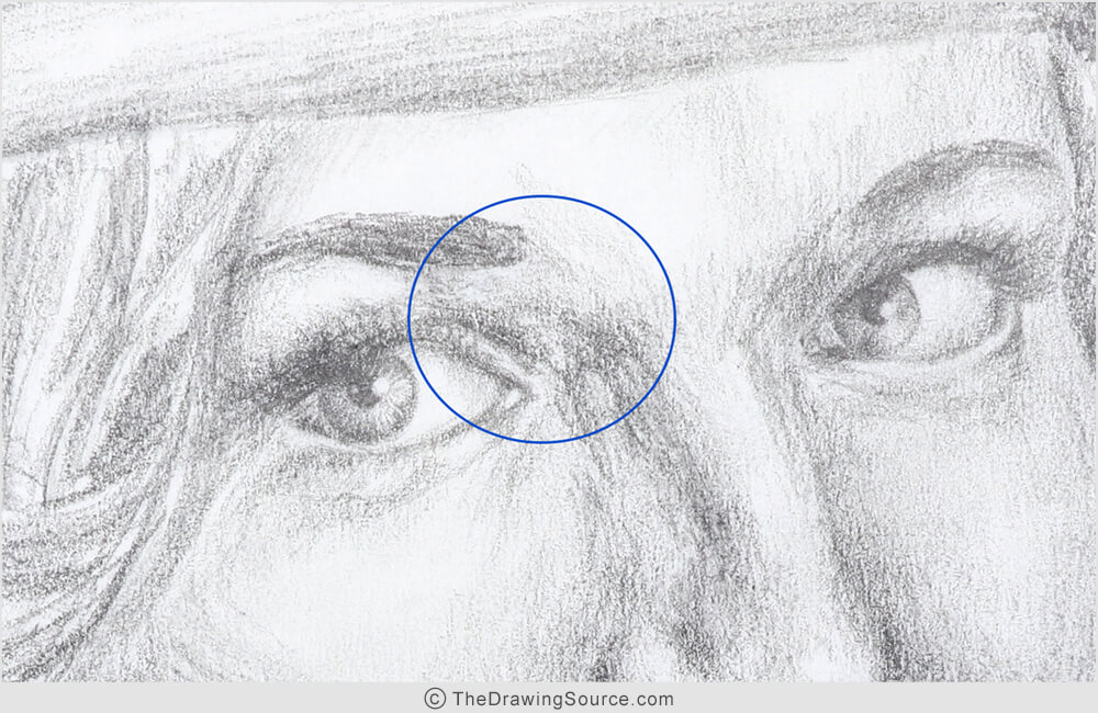
It’s kind of
ambiguous, right?
To me, it looks like this should probably have been a shadow shape. There may have been some reflected light in this area that was lightening part of the shadow, but even if that were the case: reflected light is a shadow element! We see reflected light in the shadows, so we need to make sure when drawing reflected light, that it’s darker than the half-tones in our image.
Otherwise, the result is an unconvincing drawing.
The area in the blue bubble above does not read as a clear, convincing shadow because:
- it’s not dark enough, and
- it’s not consistent enough. Meaning:
Look how many values there are within that shadow shape. Notice that there are spots within that shadow that are just as light as the lightest areas in the drawing!
Ultimately,
there is no clear organization of light, half-tone and dark, and this is
greatly decreasing the realism of this drawing.
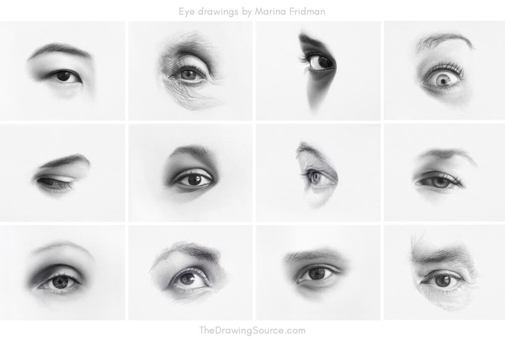
If we
compare my older drawing to my more recent eye drawings (below), can you tell what’s light, half-tone
and dark value in the newer drawings?
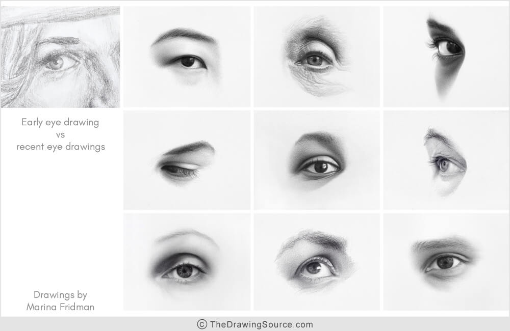
It’s very clear,
right?
To create a
realistic drawing, of an eye or anything else, we must separate what’s light, half-tone,
and dark.
Solution to Mistake 3:
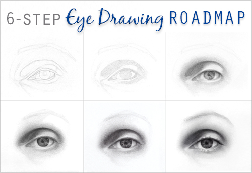
We can avoid this common mistake by creating a value structure early on in the shading process.
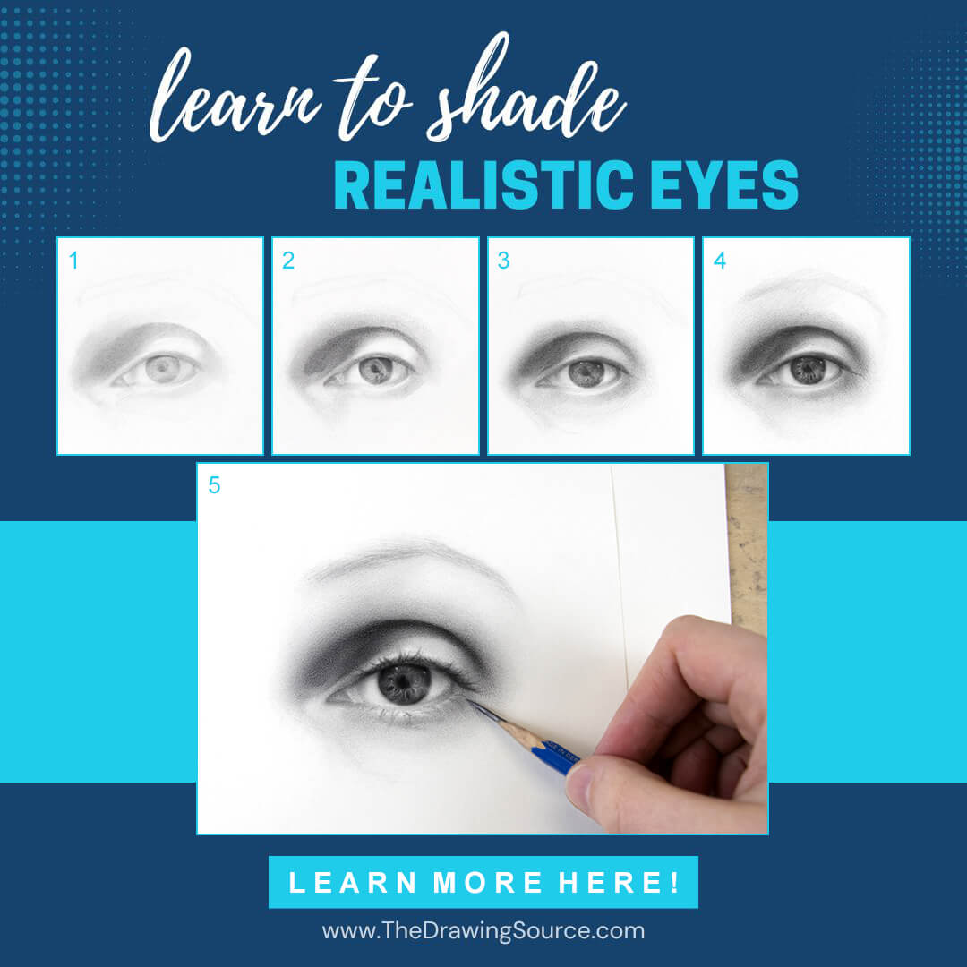
Look at the first two steps of my shading process below. Even
though the values are all very light, you can already start to tell what’s
going to be light value, half-tone value, and dark value. I start creating the
value structure as soon as I start shading, and it’s carried through the entire
shading process.
Notice also that I don’t add details like the eyelashes
until the very end of the shading process! Remember: detail is the icing on the
cake.
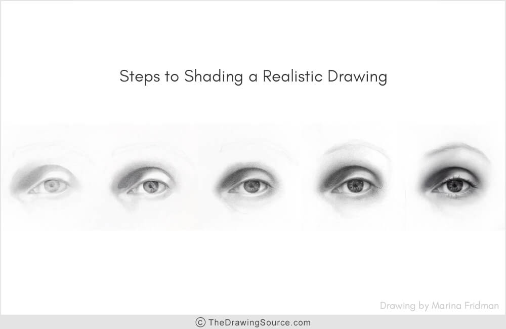
To
start creating a value structure, you first need to learn to see it! To see your
subject as those three values: light, half-tone, and dark.
To do that, squint at your eye reference – actually half-close our eyes while observing your subject or photo reference that you’re drawing from.
We squint because it increases the contrast of the subject, and it blurs together detail, making it easier to see and group together the light, half-tone and shadow areas.
Questions to Ask Yourself to Guide Your Observation
Squint at your subject and ask yourself:
-
How would I draw this subject using only three values?
Start
by determining the two extremes:
- Where are the darkest values on my subject?
- Where are the lightest values on my subject?
The remaining values are usually the half-tones.
Once you can see the 3 value groups, return to your drawing and check:
- Does it reflect the 3-value structure that you’re seeing on the subject?
- Are your dark values
dark enough and in the right place?
- Are your light values light enough and in the right place?
- Do you have true middle values, that are lighter than your dark values and
darker than your light values .. and are your middle values in the right place?
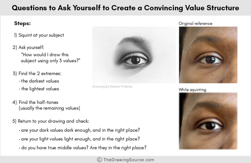
This
is an essential mode of seeing to master, in order to shade eyes, or anything else,
realistically.
You can learn how to create effective value structures in my Intro to Smooth Shading in Graphite course here, where you'll also develop the technical skills to shade beautiful eyes. Intro to Smooth shading is included in the Eye Drawing Intensive!
Most Common Eye Drawing Mistakes
Mistake
4) Leaving the ‘white of the eye’ completely white
The anatomical name for this part of the eye is the sclera,
and it’s a layer of dense connective tissue that makes up the outer coating of
most of the eyeball. Of course, we only see the part of
the sclera that’s between the eyelids.
(... well, hopefully.)
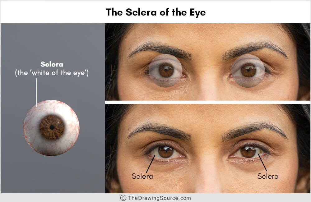
Because it’s commonly known as the white of the eye, leaving it
white is an easy mistake to make when first learning how to draw eyes. However ...
The sclera is almost never completely white!
And
drawing it white could be making your eye drawings look flat and
two-dimensional.
If you’re wondering, “What
do you mean, the white of the eye isn’t white?” consider this:
The eyeball is ... a ball! A sphere. What happens when we illuminate a sphere?
The fall of light creates a range of values, or shades of gray. These gradually darkening shades of gray create the illusion of three-dimensionality.
Because the
eyeball is a sphere, we see the same thing within the sclera:
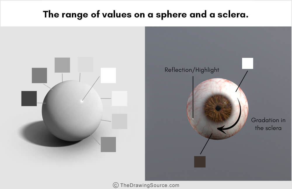
Can you see the range of values in the sclera above?
There will also often be reflections, or highlights, in the sclera, that are often lighter than the rest of the sclera.
Let’s look at some examples!
Example 1:
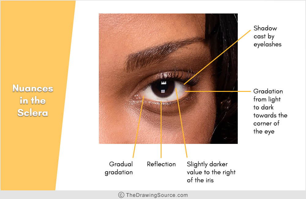
Though the
sclera here may appear white at first, look at the reflection/highlight. Can you see that
it’s lighter than the rest of the sclera? That’s our first clear sign that the
sclera is not completely white.
Think of it this way: how would we make the highlight show up in our drawing?
By darkening the surrounding area! By making sure that the sclera around the highlight is darker than the highlight.
Now, look
how close in value the reflection and the sclera are. Both are very light, that
is a very subtle value change.
Drawing
light values, or becoming light-handed, is a skill that needs to be developed. In
case you struggle with this, I have a video with 3 effective tips for shading light values here!
So, in the image above, we can
leave the highlight as the white of the paper (if we’re drawing on white paper),
and the surrounding values will need to be a little bit darker.
What other value variations can we see within this sclera?
Look at the shadow cast from the eyelashes onto the sclera. Also, there are subtle gradations that darken towards both corners of the eye. Notice that the lightest part of the sclera is here, on the outside of the lower half of the iris. Then the value darkens to the left, down towards the lower eyelid, and to the right. The value is darker at this end of the sclera than this end of the sclera.
How about the slightly darker ring to the right of the iris!
Example 2:
In other cases, depending on the
lighting, part of the sclera could be in shadow, as it is below. The entire
right half is in shadow:
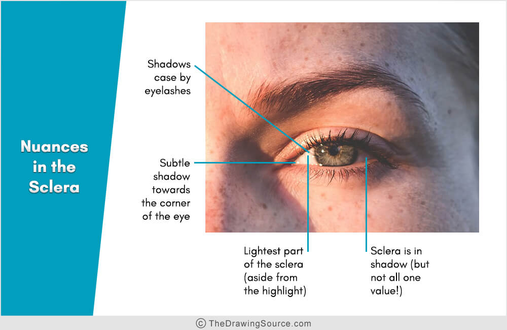
This shadow is not a single, flat
value, though, not even close. Notice the gradations and value differences
within the shadow area! There is a slightly lighter shape surrounded by a
darker shape. Within just the darker shape, the darkest portion is probably
just to the right of the iris, then it lightens somewhat, and darkens again towards
the corner of the eye.
In the left, lighter portion, again we can see that the sclera is not white because these reflections are lighter than the rest of this light portion of the sclera! To make them show up in a drawing, the sclera surrounding them will need to be darker.
Look at the beautiful shadows being cast by the eyelashes onto the eyeball – gorgeous, right? How fun to draw!
And notice the slightly darker sclera
to the left of the iris. Then it lightens lightly, and darkens again towards
the inner corner of the eye. So:
Even when the sclera looks white at first
glance, upon close observation you’ll usually find differences in value.
Solution to Mistake 4:
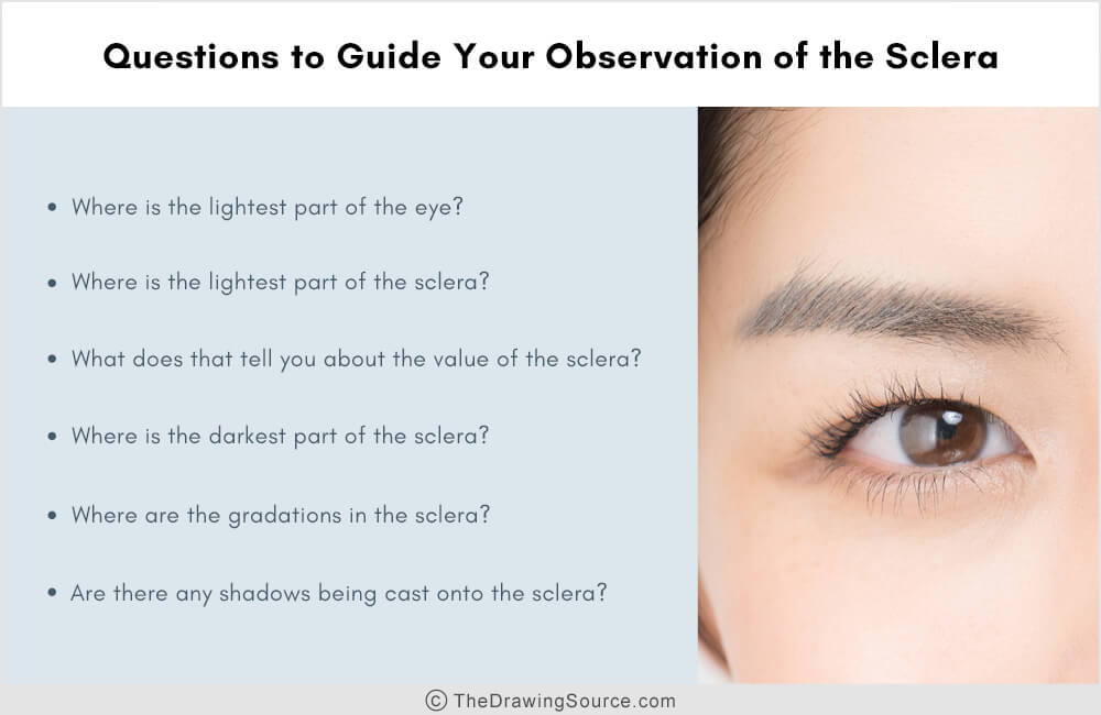
Look for gradations, shadows, and reflections in the sclera. Use the questions below to supercharge your observation.
The next
time you’re drawing an eye, to avoid sclera-related eye drawing mistakes, use the following questions to supercharge your
observation:
- Where is the lightest part of the eye?
- Where is the lightest part of the sclera?
- What does this tell you about the
value of the sclera?

For example, in the eye above, the lightest part of the eye is the center of the highlight.
The lightest part of the sclera is to the left of the iris. When I compare the two, I think the value of the highlight is lighter than the lightest part of the sclera.
This tells me that when I draw this eye, I can leave the center of the highlight as the white of the paper, and make sure to draw the entire sclera a little bit darker. None of the sclera will remain as the white of the paper.
- Where is the darkest part of the sclera?
- Where are the gradations in the sclera?
- And, are there any shadows being cast
onto the sclera?
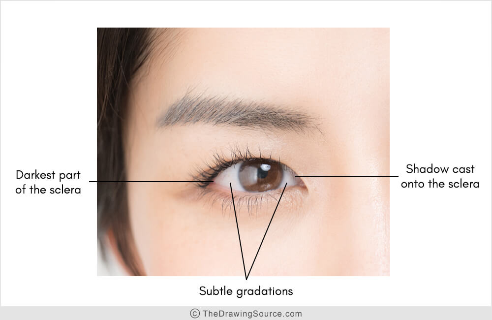
In the eye above, the darkest part of the sclera
is in the left outer corner of the eye (there is a tiiiny portion right in the corner that is considerably darker than the rest of the sclera).
Are there gradations? Absolutely. On the left side (our left, not the model's left) look at the gradual darkening from the lightest part of the sclera to the darkest part of the sclera. On the right side, there’s a lighter shape of the sclera, and then it darkens towards the right. Notice the shadow being cast onto the sclera.
These are the kinds of nuances that we
need to notice to infuse our eye drawing with realism!
How to dramatically improve your eye drawings
To dramatically improve
your drawings, often you just need someone like me to point out these things to
you, to show you what to look for, and what questions to ask yourself to guide
your observation.
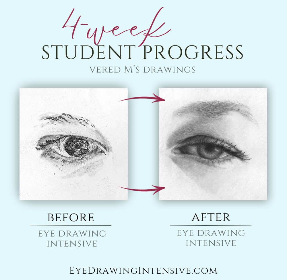
That’s exactly what we do in my Eye Drawing Intensive: a program designed to transform your eye drawings. There is a self-study option and an option to work with me one on one. If this lesson resonates with you, I invite you to learn more about the Eye Drawing Intensive here.
If
you missed Part 1 of the Most Common Eye Drawing Mistakes video series, you can watch it here:
See you there,

Enjoyed this page? Please share it!
To fix the most common eye drawing mistakes, you may also be interested in:
Related Pages
Most Common Eye Drawing Mistakes - Part 1 (Video!)
Most Common Eye Drawing Mistakes - Part 3 (Video!)
How to Draw Realistic Eyes (Step by Step Tutorial)
How to Draw Eyebrows (Step by Step)
How to Draw Realistic Lips (Step by Step)
Return from Most Common Eye Drawing Mistakes to:
Part 1 of the series | Part 3 of the series
The Eye Drawing Hub | Portrait Drawing | Drawing Tutorials | Home
